American pie.
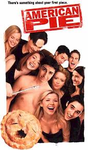
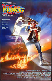
in this poster teenagers are stryotpportrayed as a typical male good guy with tye fire behind him and also the cqr. This is in fontrast with shank as both males are are shown to be quite diffrent bt yet very similar to each other also the way they layed out the paye was important a s both top male charcters in the poster are repesented as heros or important . The lay out more f the page s very important as it show the name of the movie ane tye main character of the movie. ing very out going fun and close as they are all around eachother also they are shown to be a little unorthodox as the main character is shown to be naked sorrounded by femalees. the image is used as it is very close that shows there relationship between them. there is a lot of white space but yet it works with the image as a klot of writing is not needed in the poster. also the colour red stands out in the poster as the background is white. there is one tagline whitch works very good with the poster there are not slogans used.
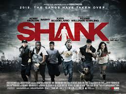
teenagers are being repesented as being viloent and agressive as they are running with agressive dogs and weapons in there hands. the image is used effective as it it urban and establishes the background also the gary gives the poster a type of mood. this contrast american pie as this is shown to be more agressive the layout is simplethe red name stands out as it is bold and its good that is placed ontop as it draws the viewers eyes to the poster also the bacground is good as it looks good.

No comments:
Post a Comment