in this blog i will be analyzing how i attracted my target audience and the way i addressed them.
in my media project (magazine) i in copartaed a slogan "Hungry for riches" this would entice a young audience as it is something new and what the magazine is fundamentally based upon. Also having the newest rapper and quote from him will draw in the loyal fans and other hip hop fans as it gives the audience a new insight into the life's of the person they idolize.
i have also researched colours that stand out of the crowd and in my research i found out that bright colours like red and orange stand out more because the eyes get drawn to them. in all my pages i have put a bit/some red in so that it stands out and my audience picks it up.
i also highlighted the contents of the magazine by putting out famous rappers such as drake and other big names on the cover so that the RnB audience can get attracted to the magazine aswell. i have resembled my magazine to other big and successful magazines such as XXL and VIBE, as they are the magazines i got my inspiration from.
I will be analysing the target audience for my media product and discuss if that person is still my target audience or of that person has changed since my brain storm and development stage.
the kind of music he listens too was important to know that if he would be a fan to my media project. Jerome likes:
Biggie smalls - big papa
Drake - stared from the bottom
Bob Marley - no woman no cry
these are only some of the artist and songs that Jerome likes and why I have created this magazine for him and the people that are like him.
in this blog i will be creating the argument, why my blog represents particular social groups?
the first think that i will look at is my target audience and how the magazine represents his perticlar social group.
My target audience enjoys spending time with friends, these friends would also enjoy `new era` and all the other things that u get with the magazine such as information and photos of artist. the target age that would be most likely to read my magazine or be interested in the topics are 16-29 year olds. I think that that is suitable because they would most likely know and relate to 90s hip hop and have similar views to the magazines opinions. the magazine would most likely be suitable for the African, African-American, Carrabin, south American and American. as statistics have sown that these ethnic groups listen to hip hop and RnB the most.
I will be discussing the ways my media blog challenges and develops the medias forms of conventions.
my opinion is that my blog does not challenge he forms of convenience so much as I have developed my work from existing pieces of work that have been created by media companies such as XXL, VIBE and the source magazine.
the similarities between conversional magazines is that they both have the title at the front covering a large section of the page above in big capital letters.
also a part of the model is covering the top of the magazine same this shows that this magazine has been edited and it has been photoshopped like most professional magazines.
the artist has a quotation form his interview on the front page letting the reader know what kind of context that magazine interview might have.
I only have one model for the cover page as the interview is mainly focused on this artist (the reason for this is below).
I have placed my barcode at the bottom left handside of the corner.
the actual artist is wearing "bling" like most hip hop magazines
the date is at the front with the website of the magazine and he artist name in big writing covering some of the actual artist.
Developing and challenging the conventions of a real media product.
I did my title "new era" that big like normal magazines because I waned the consumer to know straight away what the magazine. also it will be easer to grab the consumers attention if the magazine title was big and bold. I placed my slogan "hungry for riches" directly below the title so that the consumers know and recognise the slogan when they hear it by below and above the line advertisement like word of mouth or magazine stands. I made my model cover some of the title but not the important parts as I wanted my magazine to look and feel professional to the readers. me making my magazine look professional will give the consumer (target audience) a better read and the feeling of reassurance with the magazine. I have also used professional software such as photoshop to create this task (the professionals use this). the artist has a quote on the front cover because that creates less space so that the magazine looks like is packet with information and because it gives the consumer an in-look on the artist and this will spark an interest in the consumer to actually read he article. I only place one model on my front cover as it is the most conventional thing to do as a mixture of artist would be too hard write about also I created this magazine form pictures form 1996 to 2000 and most of the magazines that I researched had only one main model and the rest where picture's of his associates. this lead me to believe that creating a blog with more then one model as the focus of the magazine was a bad idea, however now there are more pictures of crews or bands on their cover like rock magazines such as `Classic Rock`. my artist who is a hip hop rapper does not challenge the forms and conventions of an hip hop rapper as the mese en scene in the picture shows him counting money and wearing expensive cloths and jewellery. I did this deliberately, because a lo of people know what a stereotypical rapper looks like I wanted their to be a sense of comfort and not throw in something new and over the top to scare away my customers.
I placed the date at the front of the magazine for the simple fact that I want my consumers to know the dates and issues of each magazine that I publish.
their is more then one picture on the contents page.
their is still a date on the contents page
the slogan is still there
the featured article names have bigger and bolder letters
the theme of the cover page crosses over into the contents page (the red writing)
there is side articles that get displayed when ever the actual magazine gets published such as the graffiti picture and the communities.
lastly their is the social media websites and the hashtags at the bottom.
I wanted their to be a lot of information on the contents of the magazine and I analysed contents pages and they usually had more then a picture this helped the consumer to know the information of he article better s it has been scientifically proven that people tent to formularise themselves with pictures more the words. also I the featured articles would stand out more if I changed the colours and I made it bigger this would help he consumer. I placed my social media websites and hash tags on the contents page as this would help the consumer get information and this would help distribute my work.
I specifically looked into the lady gaga double page spread when creating my own. I used the red letter of my artist so that it stands out and I have created the article in the question answer format like they did in he XXL interview with soldja boy and 50cent however I have also written on the actual picture and that is challenging the forms and conventions of the media products as hip hop magazines keep their double page spreads clean and sharp. I wanted my double page spread to stand out and be different and that is why I have included the writing on the picture. the feed back I received form it was very good as I walked around my college asking the target audience for their opinion.
MY OPINION
I think that my magazine does not challenge the forms and conventions of a real media product as i was mostly inspired by the forms and conventions of existing media products. my media product is different In its own rights however I thing when it comes to a stereotypical hip hop magazines, my product fits into the criteria.
i gave my magazine to my peeres and they told me to improve the cover. however theytold me to keep the format. and just change the layout a little bit. having taken thier advice and now i have changed my magazine.
today I was set with he task of reading an interview an to analyse the report and to pick out the key question (features) that I will be asking my famous rapper. I also need to find out hoe the reporter addresses the celeb, how the audience is targeted in the interview. all theses areas will help me in creating my Music magazine for the task.
I read an article about solja boy and 50cent in the XXL mag. the article and interview was released in 2010 over "tweeter beef" between rival rappers. the article had a picture of the two rappers (50cent and solja boy) the background was white so they stood out the most. their was a page number in the bottom left hand corner next to that it had the person that took the picture and who was in the picture. this is good if the reader does not know who the rappers are, however these sort of magazines have a neihe audience therefore the person picking up and reading this magazine would know who the rappers are.
the mese en scene in that picture is very stereotypical as the picture has all the things you would think of a "hard" new York gangster/ rapper to have:
Gold chains
Gucci shoes
Gucci belt
Cool hat
sagging trousers
tattoos
the list goes on.
the format on how the article is written is very common in an interview. the question answer format is very simple o read and entertaining. hat must have been the reasons why the producer of the magazine choose the format. this would be the most appropriate way to connect to a young audience. target audience is 16-27 year olds.
most of the page is blank as it is mostly focused on he lower have of the page. the title is very outspoken and is a quote of on of the rappers "I told you ni**as a long time ago soulja boy is my little ni**a. y`all better leave him he f**k alone for somebody get hurt". this would grab anyone's attentions and there for it is an effective title even if it is a little too much. trough out the article there was the same mood (it was always serious) even when they spoke about their music. there's is also only one colour of font with some bold lines where the question was asked this also creates a serious and gritty interview.
at this point I was thinking about hat kind of things I wanted to include into my magazine and therefore I dived in deeper to analyse this article.
the article had slang and that softened the atmosphere of the violence and the grit. this was something hat I wanted to include as I didn't want my reader to be bored and I didn't want to create a barrier for them because I want my audience to have a deeper understanding of the artist.
in conclusion I think that this double page spread was good as it had good points and bad point and that I was able to pick up on these good and bad points to I can apply what I learned to the double page spread I am going to create.
everyone has stereotypes that they associate with specific gender or race. well teenagers have also got stereotypes and the media now a days does a got job by highlighting these stereotypes. in teen drama the are mostly four stereotypes that are portrayed.
the juvenile delinquent
the dumb one
the superficial and sarcastic one
the self-aware and bitter one
characters often posses more then one of these characters and there for are multi-layered. the view might not recognise this but they are instantly making their mind up on who and how that character is and often have a first impression on that specific character. because the media is a direct reflection on society and how society is this the media use stereotypes as an advantage as this helps the audience understand that character better.
Teen Vogue is a perfect example of a stereotypical girls magazine as the front pace is of Harry styles, with big pink letters "hot holiday style".
this magazine is definitely for girls they stereotype girls as lovey dovey and very feminine. media companies do this to create a large target audience so that readers that are female can pic up their magazine. the target audience for this magazine is approximately 14 to 20 year olds. as this magazine would include the latest gossip and fashion tips the creators of the magazine would have to make the contents of the magazine widely suitable for these age ranges.
the lay out is important to attract the right target audience as hey have placed a trendy up in coming artist such as harry styles o be on the front cover. with millions of fans around the world teen vogue have brodent their target audience. the use of synergy works well as it help boost both harry styles and the magazines reputation.
Hobbit 2 was released in 2013. Its an action packed sequel to the hobbit. It is a British film as the director, Peter Jackson, and the money that was used to create the film are British. the producers are New-line cinema and Metro-Goldwyn-Mayer, also in collaboration with Wingnut films. The film is based on a novel by J. R. R. Tolkien.
Film Production. is a very important part in creating a movie as it consist of a crew of abled people working together to create a product.in the production process, big teams of people would often split up into little groups to finishes a specific scene or something else that would help in creating the product. for example the sound track for a section of the film would be created and produced by a team of people and they have a manager to go back to for help or inspiration. the film production is one of the most important parts of the film as it depends on the execution of the film, so it would be natural for the film to consist of changes to the story line and.
The person who is in-charge of all this is the producer and his executive producers. they have the roll in looking over all the production stages and also the other aspects of creating a successful film or movie.
Carolynne Cunningham, Zane Weiner ,Fran Walsh produced the hobbit 2. in the production stage of making he film the budget is set out already for hobbit 2 the budget for the film was 225 million dollars. And most of that went to the actors that played in the film such as martin freeman and Ian Mckellen who are associated with the lord of the rings franchise. in the production stage he star system has already been used as the characters and rolls have already been picked out and assigned to specific actors who the fans can associate them selves with the lord of the rings franchise.
In this stage of making the film, the first stage, screenplays and reading trough he script to find out key screens and find out if the script is going to over go any key changes are met this lies in the responsibility of the associate producer. the legal side is deallt with the executive producer, this includes things like copy write and or important things so that the company can not get sued or any legal action can happen against the company.
the ideas for the sound track and how much the actors get paid will be figured out at the production stage. directors would often use the star system to make their film stand out and would attract a larger audience then if it was someone no ones has ever heard about.
the forms of promotion they use is below and above the line advertisement.
ABOVE THE LINE: posters, trailer, interviews, public premieres, toys, lego games, video games, figurines etc.
BELOW THE LINE: forums, social media websites (twitter, Facebook, instagram).
warner bro. picture promote the movie as they also put money into making the film.
the trailer for hobbit 2 is above the line advertising as it took money and a lot of time to crate. this trailer was released shortly before the actual movie got released.
there are also some other means to advertise for example the behind the scenes cost nothing to make you would just need to have a camera this is classified as below he line advertisement.
this project was set as part of my course work me and my team worked non stop to create a swede. our trailer had to be X-men origins. we all took part into creating the swede. first of all we planned what we are going to do like in a real film, this was called the production stage. we assigned roles to every one Joshua askew director and team leader.
I was part of making the props and also the acting team as I was sabertooth.
we all had a part to do with the editing and we learned different things and helped each other. this blog is evidence that we all contributed in the production of the swede and we even made interviews.
X-Men Origins
Distribution of swede
everyone in my group had the shared responsibility of distributing and making sure our swede is widely available for our audience I did this by posting a link on twitter (below the line advertisement) and this helped get our swede more views. I also placed a post on facebook for everyone to click so that they can view the swede.
hello, im Flynn. today im going to be taking about swedes. know you might say what's a swede, well a swede is a fan made clip of a trailer with comedic personalities.
swedes are usually of a very low standard and they didn't have or had almost no budget so please do not think that this person wanted to make it perfect because a swede is suppose to be not perfect.
dark knight swede
this swede was created by fans of the original trailer and they took the effort to make their interpretation on how they think they would do it. to see the original go on YouTube and click dark knight rises trailer.
swede trailer help advertise a film without the film industry spending money and that is called below the line advertisement also. this would encourage other fans of movies all around the world to create swedes and this would stop lazy behaviour as your putting your time in something creative and this is good also the film industry might see you advertising something so good and they might hire you.
I'm going to write about television adverts and explain the use of diegetic sound non diegetic sound and the other aspects that make the advertising good and effective for the audience. now I will analyse 5 adverts that have been released on British TV.
Burger King Angus XT MMM
the advert starts with diegetic sound of the customers in burger king then the diegetic sound of the actor "mmmm" becomes louder. as this happens the camera shot changes into a close up of the actor holding the burger. the camera cuts to a medium shot of for people in the elevator the diegetic sound of the "mmm" over powers the noise of the elevator and the people sighing. they use non diegetic sound when the female actor picks up the phone and hears the mals voice continuing to "mmm" over the phone.
the "mmm" trough out of the clips tells the audience that the burger he bit into is very nice and they should buy it as it has a lasting effect. also because this advert is so ridiculous this last in the reader longer.
at the end the use of post synchronised sound of the narration is very effective as the voice had bass this sound was added in when they where editing the clip.
Persil garage band
in this persil advert there was a lot of parallel sound as the music played was pre-recorded and was placed on to the clip at the editing stage of creating this clip the was a little diegetic sound at the beginning and the narration at the end was very effective because the voice was very gentle and calm this would connect with there target audience as the mese en scene of little children getting muddy can be related to mums. also there was a lot of effects in this clip as the mud on the camera was placed in after the scenes where shot.
Go Ahead Snack enlightenment
for this clip there was diegetic sound at the begin (tennis ball hits ball) however it moves on to non diegetic sound when the birds are singing also it could be classified as post synchronised sound the music used to create a calm and collected mood. the editing of this was very fast as the narration of the man works well with the cutting of the shots. the use of the Chinese music was edited in afterwards the scenes were shot and done.
Citroen DS5 TV AD
the advert demonstrates sound trough out as it is mostly post synchronised sound as most of the sound was edited in later on in the production stage. the sound is also parrell sound as in the clip the orchestra players where playing their instruments along side the sound that was edited in later. later on the narration is placed into the clip like most advertiments in the media world and that is also non diegetic sound as it was placed in then clip after they shot the scenes. this has also have the companies logo and the theme song at the end to advertise and make sure that people know where to get the car form. this advert is effective in their use of sound and camera shots.
Yorkie shopping bags
the clip starts with non diegetic sounds of birds singing and then a introduction of intense music playing in the background however that is disturbed by the actors sigh and the music continues. the use of effects like the explosion of the fire is very comedic and eases the seriousness of the clip as most of us have been trough something similar. the use parallel sound when he kicks open the dor was used effectively. this clip ends with narration as most adverts do and the chocolate bar its self is edited into the clip with its logo and name.
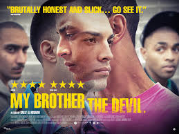
my brother the devil is directed by Sally El Hosaini and the stars featured in the film are James Floyd, Fady Elsayed. this film was critically successful as it won a lot of awards.
its a British film, set in urban London about a two brothers and how they are fighting society for their right to life a gang free and normal life. it won a lot of awards including the Sundance Film Festival and at the Berlin International Film Festival in 2012. it was released in two countries UK and USA there where only two screenings in the USA but it was screened in the UK in the London film festival and a couple cinemas in the country.
MBTD represents social times in Urban London as it faces the issues of teens and their rights to express themselves how they please.
for this I created a magazine for school. I used the pictures I took and all the information is made up. the Magazine is going to be advertising a school and its going to include interviews and activities that a student and their parents might look for in a school.
In this magazine I created a big title and I have made the letters big and bold so it comes out. I choose the colour blue because it is a calm and cold colour. I researched and found out that blue is more of a serious colour and is connected with success and also discipline. I wanted my college to be a overachieving and successful kind and that's why my model (Anthony) has a sterne look on his face.
Before my magazine had a lot of pictures on the front cover however I showed it to my target audience and they told me that it was too cluttered and that it did not give the professional vibe it needed so I only place one additional picture to the magazine cover.
I took it back to the target audience when I modified it and this time they liked I.


 my opinion is that my blog does not challenge he forms of convenience so much as I have developed my work from existing pieces of work that have been created by media companies such as XXL, VIBE and the source magazine.